Square Cylinder
March 6, 2021
Lorene Anderson @ K. Imperial
by Mark Van Proyen
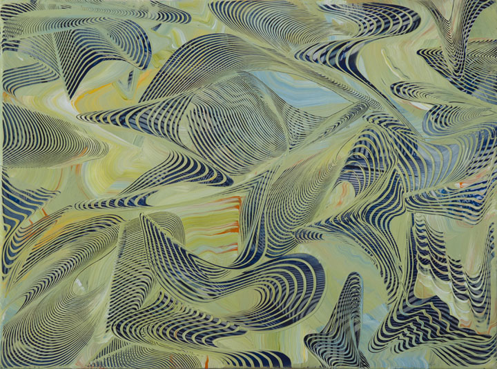
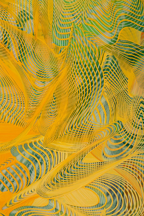
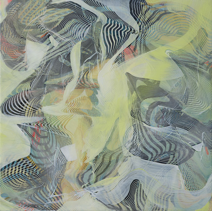
Each of Lorene Anderson’s 15 recent paintings (2018-2021) prompts a single question: what are we looking at? The more one looks, the more complicated the answer becomes, and that is the source of the fascination and secret pleasure provided by these works. They destabilize and restabilize right before one’s eyes, seeming at once to be compositionally locked down and at the same time full of centripetal and centrifugal energies looking to burst from the confines of the picture plane. In them, we catch layered glimpses of fingerprints, moiré patterns, diachronic maps and schematized weather systems, all revealed in a chromatically saturated palette of glistening acrylic colors that hark back to the sunshiny aspects of Impressionism, while also looking toward the kind of techno-psychedelia that we might associate with the experimental cinema of the late 1960s.
It takes a keen eye to unravel the technique behind these works. At first glance, a beholder might fairly assume that their configurations are the result of stencils or templates made by a CNC machine. That might be true, but close inspection shows no sign of the telltale paint ridges that result from the use of stencils, indicating a patient, freehand application of pigment and interference medium. Tiny squeegees seem to be the preferred tools for paint application, worked in concert with squirt bottles or (possibly) hypodermic needles.
In almost all cases, there are three or more visible layers of painterly activity in these works, separated by distinct layers of thick, transparent medium so that the top strata are suspended above and separated from the bottom ones. In most cases, we can see that the bottommost layers are made from randomly poured and splashed paint, which, when dried and then sandwiched underneath another layer of transparent medium, form a set of visual prompts that guide the more deliberate strata of paint that are subsequently applied. The top-most layers coalesce into configurations based on the sequential repetition of several hyperbolic spirals that are dispersed across the picture surface in ways that tease the possible emergence of some kind of figure-ground relationship that never fully materializes, always reverting back to an all-over compositional strategy that teases and then denies a stabilizing pictorial architecture, with all its implication of durable hierarchy.
A typical example of Anderson’s approach is found in Somersault, which features several convoluted webs of obliquely positioned moiré patterns arrayed around a light-yellow shape near the center of a square picture plane. Each of these moiré patterns pulsates between involution and extravolution, like visual whirlpools that both attract and repel the eye’s navigation of the work. Cleaving Grain operates as a tighter composition than many of the others, and this is in part attributable to the relative invisibility of the initial poured paint layer, which makes the convoluted moiré patterns rendered in yellow and orange seem crisper and more deliberate than is usually the case. Also, it is one of the few works in the exhibition that is not executed on a square support. Instead, its orientation is that of a landscape, albeit one where foreground, middle distance and deep horizon blend into a vertiginous spatial miasma.
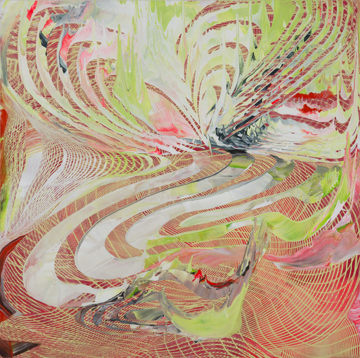
By my lights, the best work in the exhibition is Encrypted Bounce V. 2, one of the two largest at 60 x 60 inches. It is certainly the most adventurous in terms of color, this by virtue of the fact that it makes judicious use of fluorescent orange, pink and green in its orchestration of colors. Fluorescent pigments are hard to use to good effect because they are so easy to use to bad effect, meaning that they can too easily dominate a picture space in the same way that an over-use of spice can ruin a good stew.
But in Anderson’s hands, the fluorescent pigments are deployed in a sensible moderation that accords with the works other colors. Moreover, Encrypted Bounce V.2 does something else that is not visible in many of the other works, that being the re-deployment of the initiating splash-and-pour technique at the final phase of the work’s execution, on the final top layer. This brings the eye back to the initiating unruliness of the work’s inception, completing the full circle of chaos and order that is the animating principle of all of the work exhibition.
Can we call Anderson’s paintings homages to the kind of Op art that was made famous in the Museum of Modern Art’s 1965 Responsive Eye exhibition? Certainly, we have seen several subsequent iterations of the Op aesthetic since that time, most notably in the 1999 Post-Hypnotic Abstraction exhibition held at the University of Illinois. But with those precedents in mind, can we claim that Anderson’s paintings are somehow too derivative of that legacy? I would say no because they take those influences and transform them, multiplying and contorting them in ways that make the paintings look and feel profoundly contemporary. In so doing, Anderson opens the door to a new and exciting way of visualizing spatial relationships in a world where layer-upon-layer of vertigo has become the new normal.
# # #
Lorene Anderson: “Cusp” @ K. Imperial Fine Art through March 31, 2021.
About the author:
Mark Van Proyen’s visual work and written commentaries focus on satirizing the tragic consequences of blind faith placed in economies of narcissistic reward. Since 2003, he has been a corresponding editor for Art in America. His recent publications include: Facing Innocence: The Art of Gottfried Helnwein (2011) and Cirian Logic and the Painting of Preconstruction (2010). To learn more about Mark Van Proyen, read Alex Mak’s December 9, 2014 interview, published on Broke-Ass Stuart’s website.

